# flex布局
# flex基本介绍
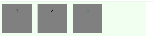
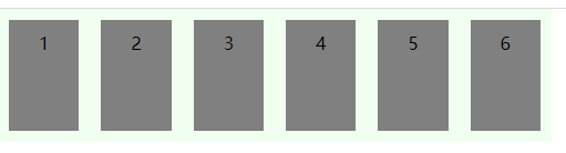
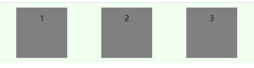
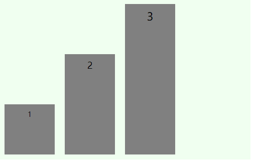
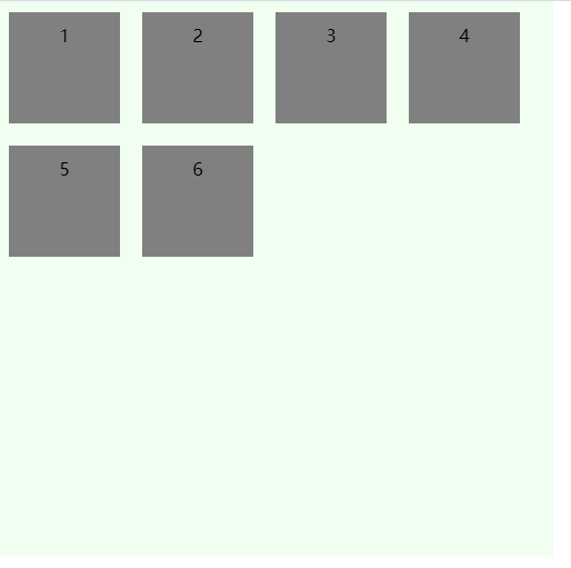
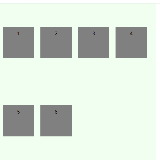
先贴一个简单的示例代码,后续讲解各属性时,均在此基础上更改。
<div class="flex-box">
    <div class="flex-item item1">1</div>
    <div class="flex-item item2">2</div>
    <div class="flex-item item3">3</div>
</div>
.flex-box {
    display: flex;
    width: 500px;
    background-color: honeydew;
}
.flex-item {
    box-sizing: border-box;
    height: 100px;
    width: 100px;
    background-color: gray;
    padding: 10px;
    margin: 10px;
    text-align: center;
}
Flex 是 Flexible Box 的缩写,意为"弹性布局"。
设置元素display: flex;或display: inline-flex;(行内元素),即使用flex布局。
采用flex布局的元素称之为“flex容器”(flex container),容器的子元素称之为“flex元素”或“flex项目”(flex item)。
设为 Flex 布局以后,子元素的float、clear和vertical-align属性将失效。
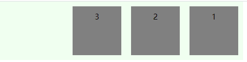
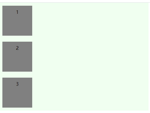
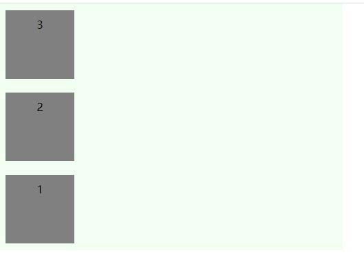
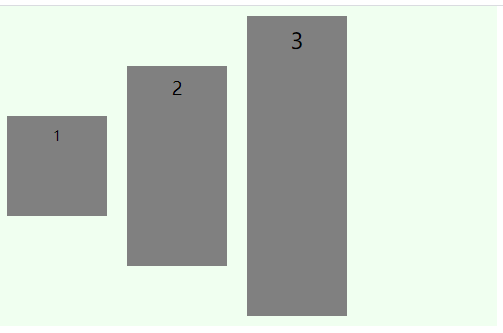
# 容器属性:flex-direction 主轴与交叉轴
flex容器的主轴(main axis)由flex-direction属性定义,有四个取值:
row(默认)
row-reverse
column
column-reverse
交叉轴(cross axis)与主轴垂直,flex元素默认沿主轴排列。
# 容器属性:flex-wrap 换行
flex-wrap定义一行放不下时,元素的换行方式,有三种取值:
nowrap(默认),宽度不够时元素会被压缩变形
wrap
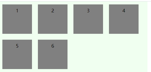
wrap-reverse
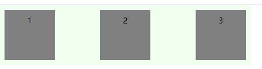
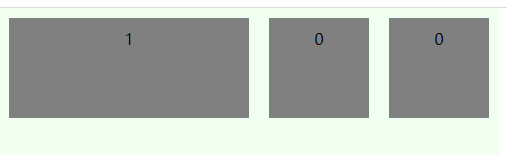
# 容器属性:justify-content
justify-content定义元素在主轴上的对齐方式,有五种取值方式:
flex-start(默认)
flex-end
center
space-around
每个项目两侧的间隔相等。所以,项目之间的间隔比项目与边框的间隔大一倍
space-between
两端对齐,项目之间的间隔都相等
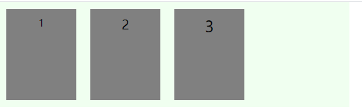
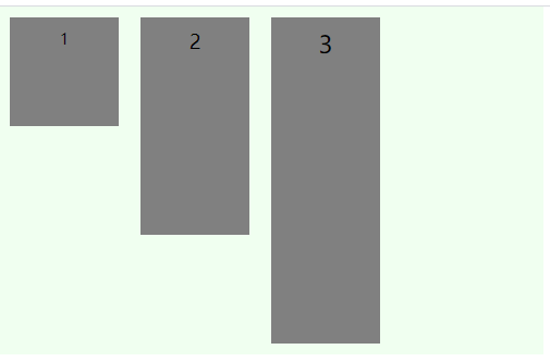
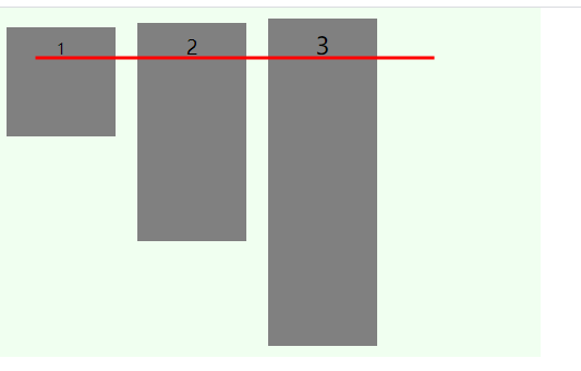
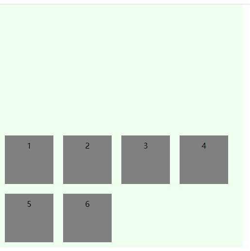
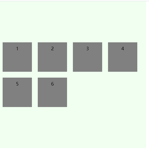
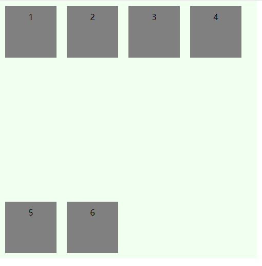
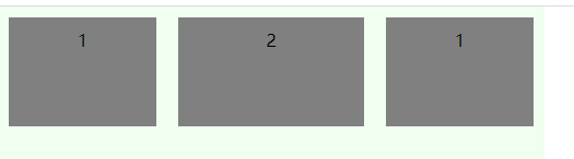
# 容器属性:align-items
align-items定义元素在交叉轴上的对齐方式,有五种取值方式:
stretch(默认)
未定义元素高度,定义容器高度,元素会被拉伸满容器高度
未定义容器高度,定义元素高度,容器会被拉伸到最高元素的高度
flex-start
flex-end
center
baseline
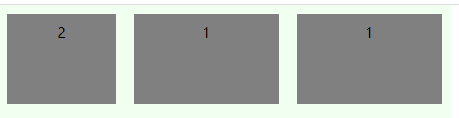
# 容器属性:align-content
align-content定义元素在交叉轴方向的对齐方式(即多行情况),有六种取值:
stretch(默认)
flex-start
flex-end
center
space-between
与交叉轴两端对齐,轴线之间的间隔平均分布
space-around
每根轴线两侧的间隔都相等。所以,轴线之间的间隔比轴线与边框的间隔大一倍
# 容器属性:flex-flow 简写属性
flex-flow属性是flex-direction属性和flex-wrap属性的简写形式,默认值为row nowrap。
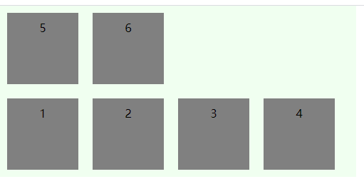
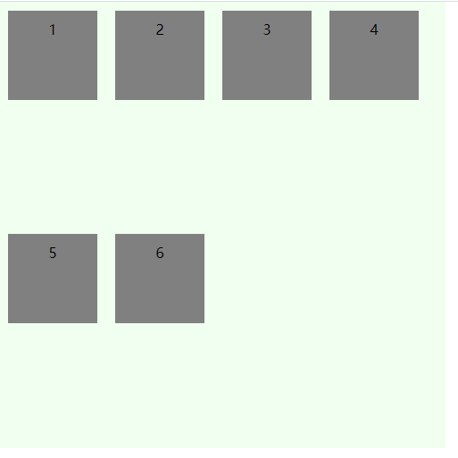
# 元素属性:order 排序
order定义元素排列顺序,数字越小越靠前,默认为0
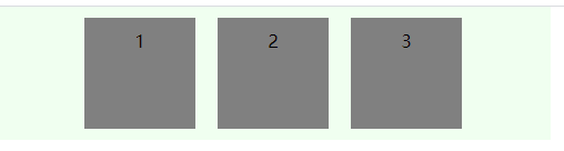
# 元素属性:flex-grow 放大
flex-grow属性定义项目的放大比例,默认为0,即如果存在剩余空间,也不放大。如果所有项目的flex-grow属性都为1,则它们将等分剩余空间。
# 元素属性:flex-shrink 缩小
flex-shrink属性定义了项目的缩小比例,默认为1,即如果空间不足,该项目将缩小。
如果所有项目的flex-shrink属性都为1,当空间不足时,都将等比例缩小。
如果一个项目的flex-shrink属性为0,其他项目都为1,则空间不足时,前者不缩小。
负值对该属性无效。
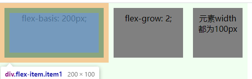
# 元素属性:flex-basis
flex-basis定义在分配多余空间之前,元素占据的主轴空间,默认auto,即元素原本大小。
# 元素属性:align-self 单个元素对齐方式
align-self属性允许单个项目有与其他项目不一样的对齐方式,可覆盖align-items属性。
默认值为auto,表示继承父元素的align-items属性,如果没有父元素,则等同于stretch。
有六种取值:
auto
flex-start
flex-end
center
baseline
stretch
# 元素属性:flex 简写属性
flex属性是flex-grow, flex-shrink 和 flex-basis的简写,默认值为0 1 auto。后两个属性可选。
flex: initial === flex: 0 1 auto
flex: auto === flex: 1 1 auto
flex: none === flex: 0 0 auto
flex: 1 === flex: 1 1 0
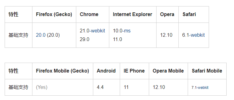
# flex浏览器兼容性
# flex布局demo
demo实现了内容充满一个屏的高度,首尾高度固定,内容自适应。 内容区分三部分,第三部分由内容撑开,一二部分平分剩余高度,第二部分超出设置滚动条。 第一部分又分上下两部分,上部分由内容撑开,下部分撑满剩余高度,超出则设置滚动条。
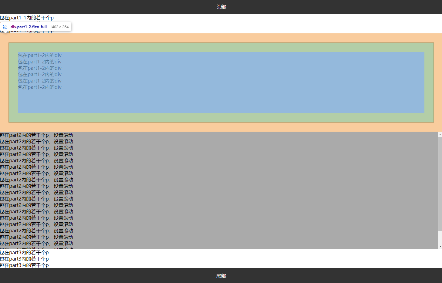
<div id="app" class="flex">
    <div class="header">头部</div>
    <div class="part1 flex-full">
        <div class="part1-1">
            <p>包在part1-1内的若干个p</p>
            <p>包在part1-1内的若干个p</p>
            <p>包在part1-1内的若干个p</p>
        </div>
        <div class="part1-2 flex-full">
            <div>包在part1-2内的div</div>
            <div>包在part1-2内的div</div>
            <div>包在part1-2内的div</div>
            <div>包在part1-2内的div</div>
            <div>包在part1-2内的div</div>
            <div>包在part1-2内的div</div>
        </div>
    </div>
    <div class="part2">
        <p>包在part2内的若干个p,设置滚动</p>
        <p>包在part2内的若干个p,设置滚动</p>
        <p>包在part2内的若干个p,设置滚动</p>
        <p>包在part2内的若干个p,设置滚动</p>
        <p>包在part2内的若干个p,设置滚动</p>
        <p>包在part2内的若干个p,设置滚动</p>
        <p>包在part2内的若干个p,设置滚动</p>
        <p>包在part2内的若干个p,设置滚动</p>
        <p>包在part2内的若干个p,设置滚动</p>
        <p>包在part2内的若干个p,设置滚动</p>
        <p>包在part2内的若干个p,设置滚动</p>
        <p>包在part2内的若干个p,设置滚动</p>
        <p>包在part2内的若干个p,设置滚动</p>
        <p>包在part2内的若干个p,设置滚动</p>
        <p>包在part2内的若干个p,设置滚动</p>
        <p>包在part2内的若干个p,设置滚动</p>
        <p>包在part2内的若干个p,设置滚动</p>
        <p>包在part2内的若干个p,设置滚动</p>
        <p>包在part2内的若干个p,设置滚动</p>
        <p>包在part2内的若干个p,设置滚动</p>
        <p>包在part2内的若干个p,设置滚动</p>
    </div>
    <div class="part3">
        <p>包在part3内的若干个p</p>
        <p>包在part3内的若干个p</p>
        <p>包在part3内的若干个p</p>
    </div>
    <div class="footer">尾部</div>
</div>
p {
    margin: 0;
    padding: 0;
}
.header, .footer {
    height: 50px;
    line-height: 50px;
    text-align: center;
    background-color: #333;
    color: #fff;
}
.flex {
    display: flex;
    flex-direction: column;
    height: 100%;
    width: 100%;
    position: absolute;
}
.flex-full {
    display: flex;
    flex-direction: column;
    flex: 1;
}
.part1 {
    min-height: 300px;
}
.part1-2 {
    margin: 30px;
    padding: 30px;
    background: gainsboro;
    border: 1px solid;
    overflow: auto;
}
.part2 {
    min-height: 300px;
    background-color: #aaa;
    overflow: auto;
    flex: 1;
}
# 参考
CSS弹性盒子布局-MDN (opens new window)